
Accessibility was the biggest challenge for this app. We wanted to create an art app that was educational and inspiring but most importantly we needed to make sure it was accessible to users of all abilities. During our usability studies, we found two main issues for users. The first was being able to select and change the language at anytime. The second issue was having the option to have an audio description read aloud that could describe an art piece and read information about the artist.
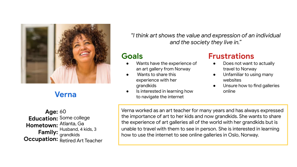
In my beginning research, I found there were many people that had an interest in a mobile app that would give them information about artists and the work they did. I created a persona for the users I was designing for. Verna is a 70 year old mother and grandmother and retired art teacher who wants to share her joy of art with her grandkids. Due to her age and health she is unable to travel with her grandkids to visit museums and galleries around the world. She would love to have an app to use to help her learn more and share the beauty of art and the history it has with her grandkids.
"I think art shows the value and expression of an individual and the society they live in."
- Verna, Persona
UI Ideation
Here’s how we put our users’ needs first. The process below begins with our initial wireframes, then moves to mockups, and finally to the high-fidelity prototype.
Wireframes
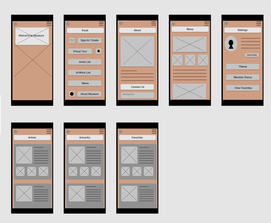
I started with paper wireframes to plan out the form and function of each of the screens the app and website would have. After this, the paper wireframes were turned into low fidelity digital wireframes and then to a low fidelity prototype to better inform my decisions about how the app would look and function.In this first version, the home screen opens the app with the ability to tap on the kiosk to open the menu and continue the navigation to the art and artist. It also includes a button to change the language.
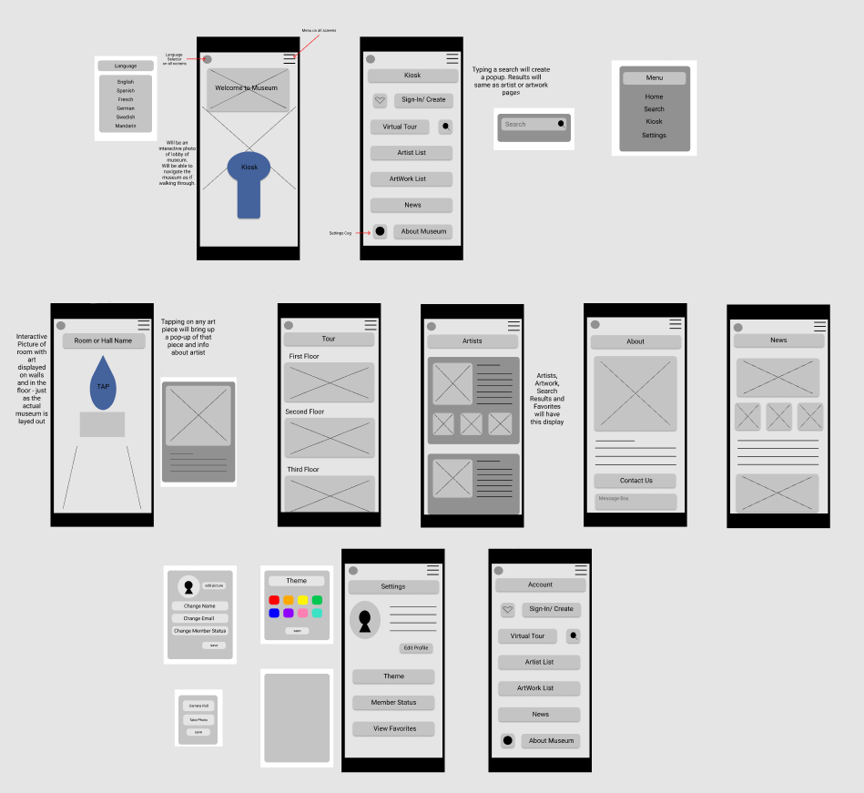
Once this process was complete, I conducted a usability study using Zoom to see how users would feel about their experience with it and what improvements needed to be made. I learned that there were three main pain points for users. First,
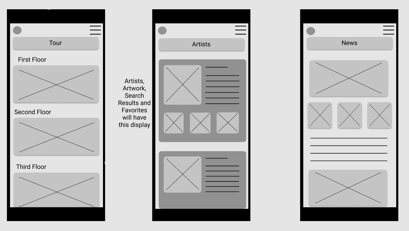
- Users were confused by the navigation of trying to go room to room on the app. Many users expressed a desire for a simple list of artwork and a list of artists. Therefore this was change to a simple scrolling view.
-Users wanted an option to save art pieces or artists themselves to a favorites section to quickly reference again later. To do this I created a section of "Favorites" that a user could quickly navigate to. They could also add to (or delete from) the list as they are viewing the list.
-Users wanted to have a quick navigation bar that we added at the bottom of every screen so users didn't have to go to the menu in the corner every time they wanted to look at another area.
This made using the Art History mobile app experience more enjoyable, which helped meet the user’s needs.
Revised Wireframes After Low Fidelity Prototype and Usability Testing
In the revised version, you see the progression of the design based on insights identified from usability test feedback.
I removed the "virtual tour" option and expanded the list of artists, artworks and added a favorites list. After gathering the information from the study, I made sure to apply those solutions to a new set of high fidelity mock-ups and a prototype. I conducted another usability study to ensure the issues from the previous study had been addressed and sought out further improvements.
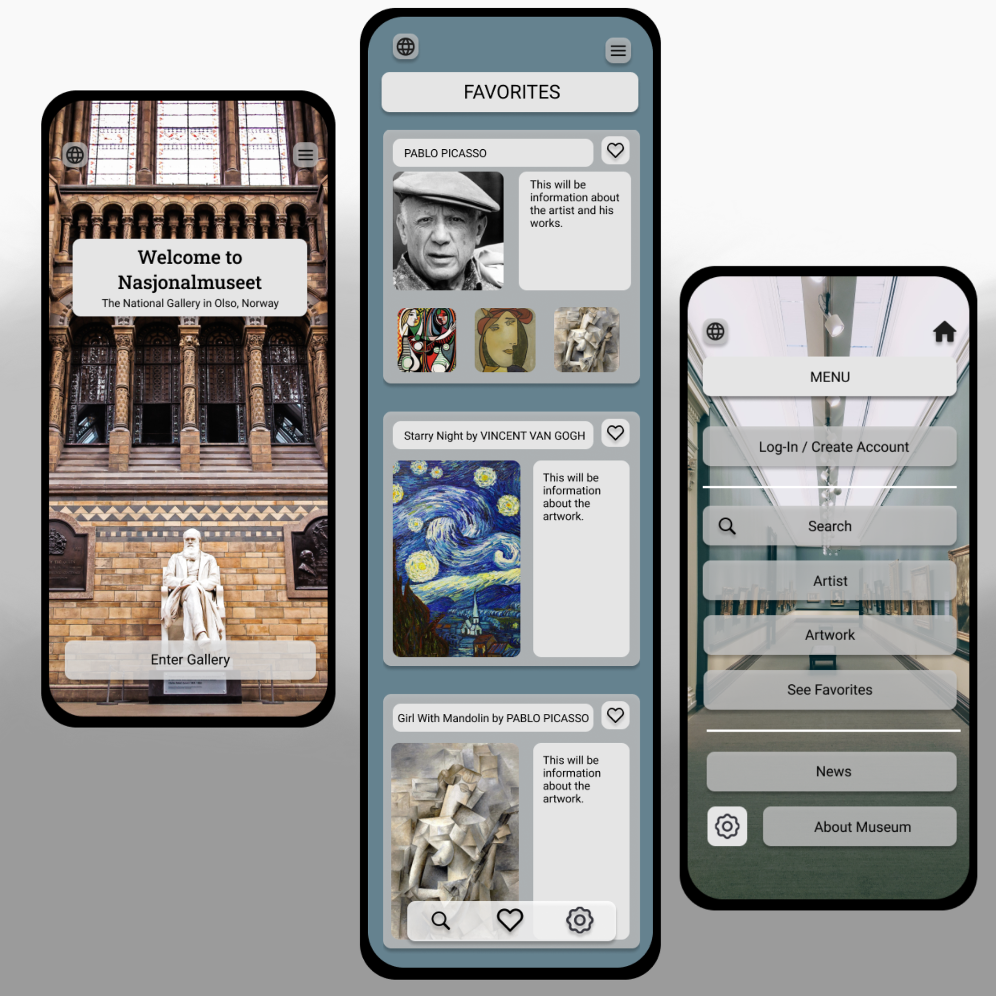
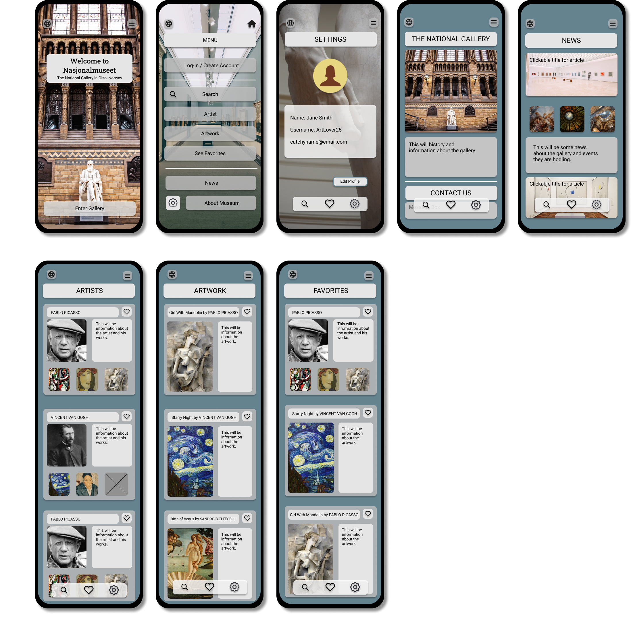
High Fidelity Prototype and Final Design
The photo below shows the fully developed mobile app in it's completed design. It addresses the needs the National Gallery in Oslo, Norway had, along with the needs of their user's, for a simple and inspiring design where they can easily view and learn about art history and save their favorites.
If you like what you see and want to work together, get in touch!
sarahavilene@gmail.com