The biggest challenge of this project was the magnitude of how much information and functionality that I would need to incorporate. I also wanted to create an app that could be used by anyone, from any device. Not Alone syncs between devices so you can begin entering information on one device and continue on another. I also wanted to incorporate a wide variety of topics that could be tracked in one account. For many users it is inconvenient to use different apps to track their moods, nutrition, fitness, menstruation, etc. Having all of these apps in one would increase the functionality of their daily lives therefore improving their quality of life.
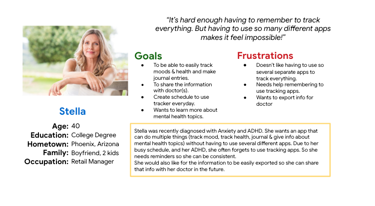
The idea behind the design of this ap. and website was to keep them as clean and streamlined as possible. In my research, I found there were many people across a wide range of ages and walks of life that were interested in a mental health app. And they all had different needs to be considered. So I created a persona for the users I was designing for. Stella is a 40 year old mother and retail manager who was recently diagnosed with anxiety and ADHD. She has a busy life and doesn't have time to track her information in multiple apps. She also wanted a way to access links and articles about her mental health and find resources for further care. I kept her in mind as I started my design.
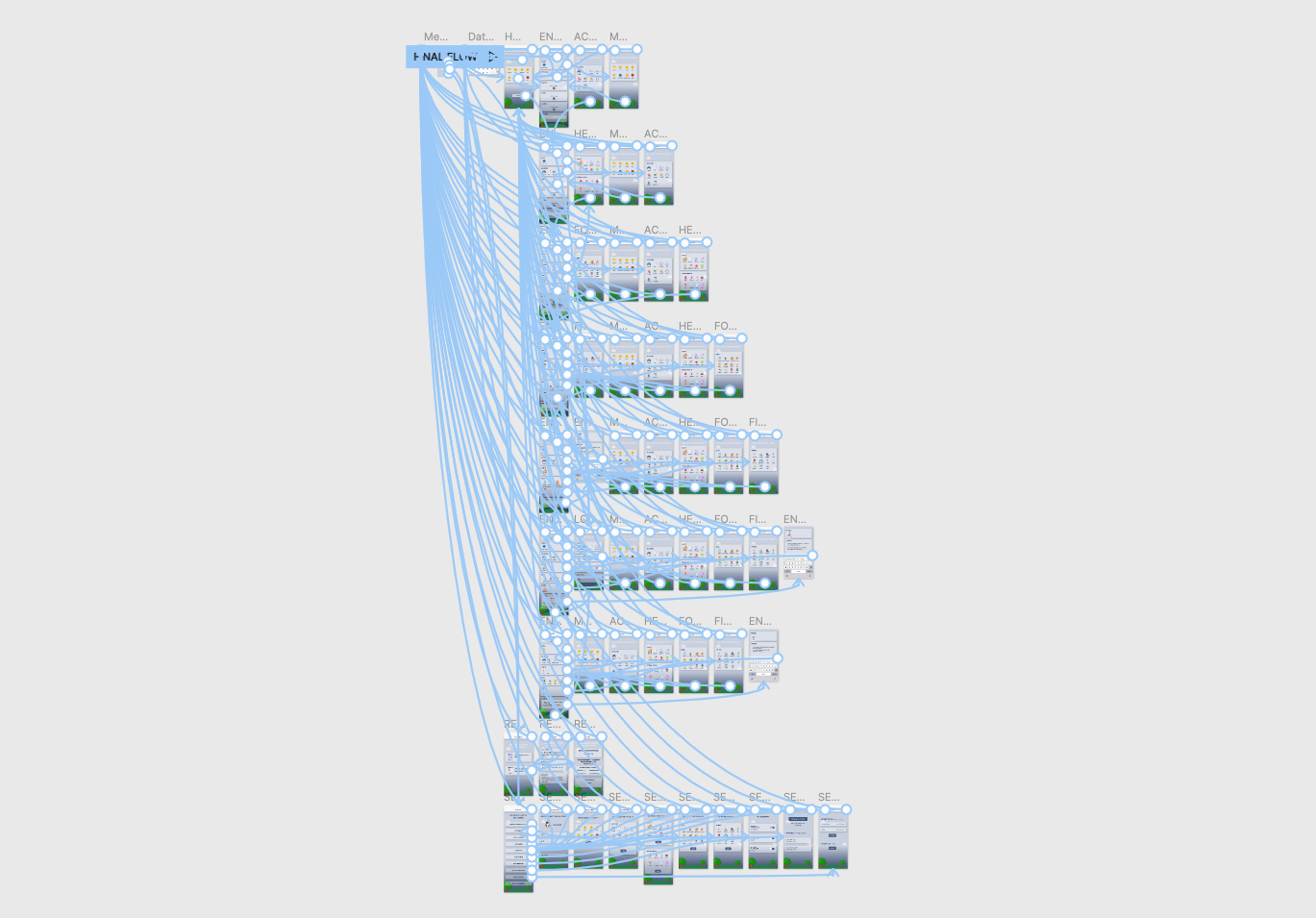
Wireframes
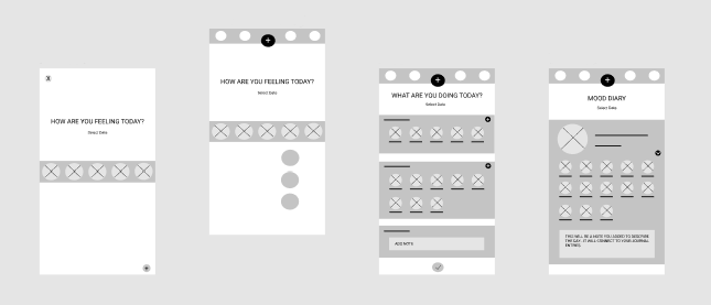
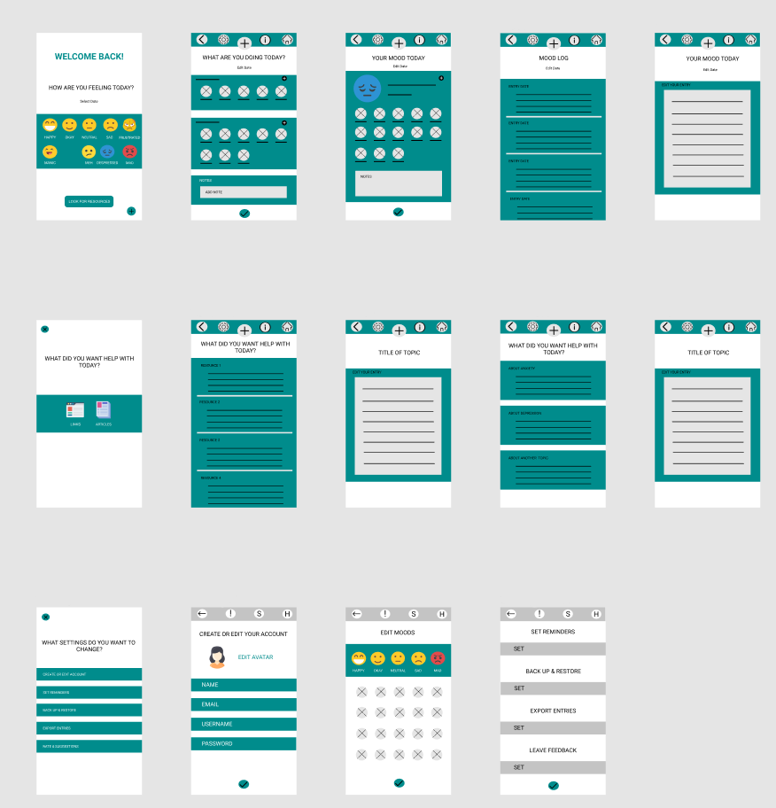
I started with paper wireframes to plan out the form and function of each of the screens the app and website would have. After this, the paper wireframes were turned into low fidelity digital wireframes and then to a low fidelity prototype to better inform my decisions about how the app and website would look and function on various screen sizes. In this simple version, you can see how I approached solving the user’s needs. The first screen of the mobile app starts with being able to enter your mood for the day. You can tap to add the mood you are currently in or tap on the + go to the settings and edit the moods that appear on this screen. The first screen for the website has both options on the screen so the user can do either option right away.
Research & Usability Study Details
Once this process was complete, I conducted a usability study through Zoom to see how users would feel about their experience with it and what improvements needed to be made. I learned that there were three main pain points for users:
- There was no link on the opening screen to go to the resources page. I solved this by making sure there was a button at the bottom of the screen so users could complete this action.
- The size of buttons used on mobile devices. The small buttons caused users to select incorrect options which resulted in frustration. I solved this issue by making the buttons bigger and more recognizable.
- Users needed a bigger font size on the mobile app. I resolved this issue by increasing font size and creating links to click on to the original articles.
This made using the Not Alone mobile app experience more enjoyable, which helped meet the user’s needs.
""This is much better! I can now push the right buttons and I can actually read the information easily. Now I can get the help I need!
- Stella, Persona
Revised Wireframes After Low Fidelity Prototype and Usability Testing
In the revised version, you can see the progression of the design based on insights identified from usability test feedback.
After gathering the information from the study, I made sure to apply those solutions to a new set of high fidelity mock ups and prototype. I conducted another usability study to ensure the issues from the previous study had been addressed and sought out further improvements.
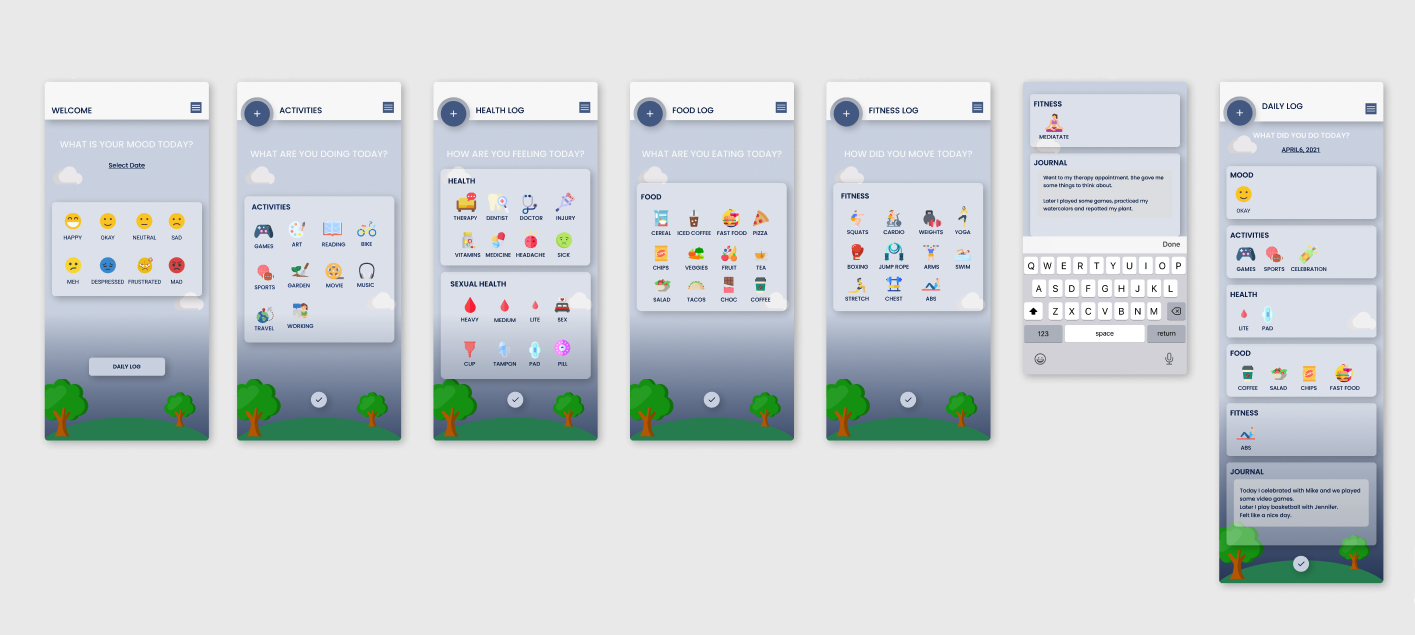
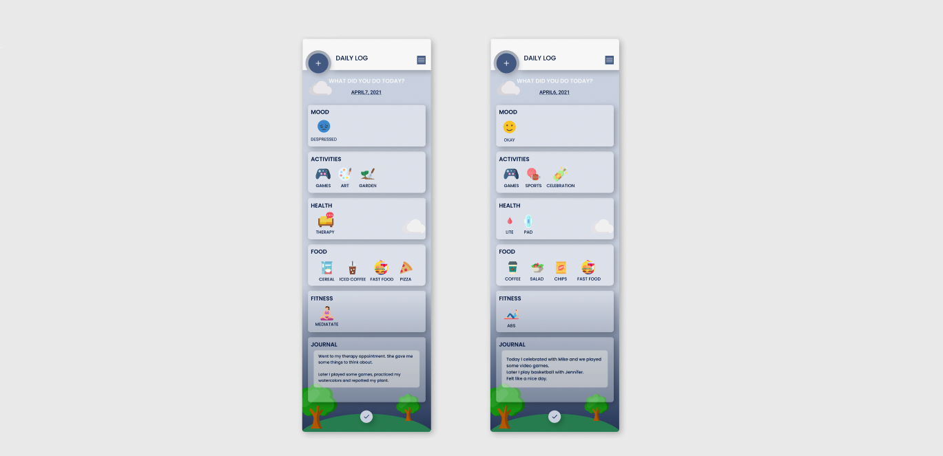
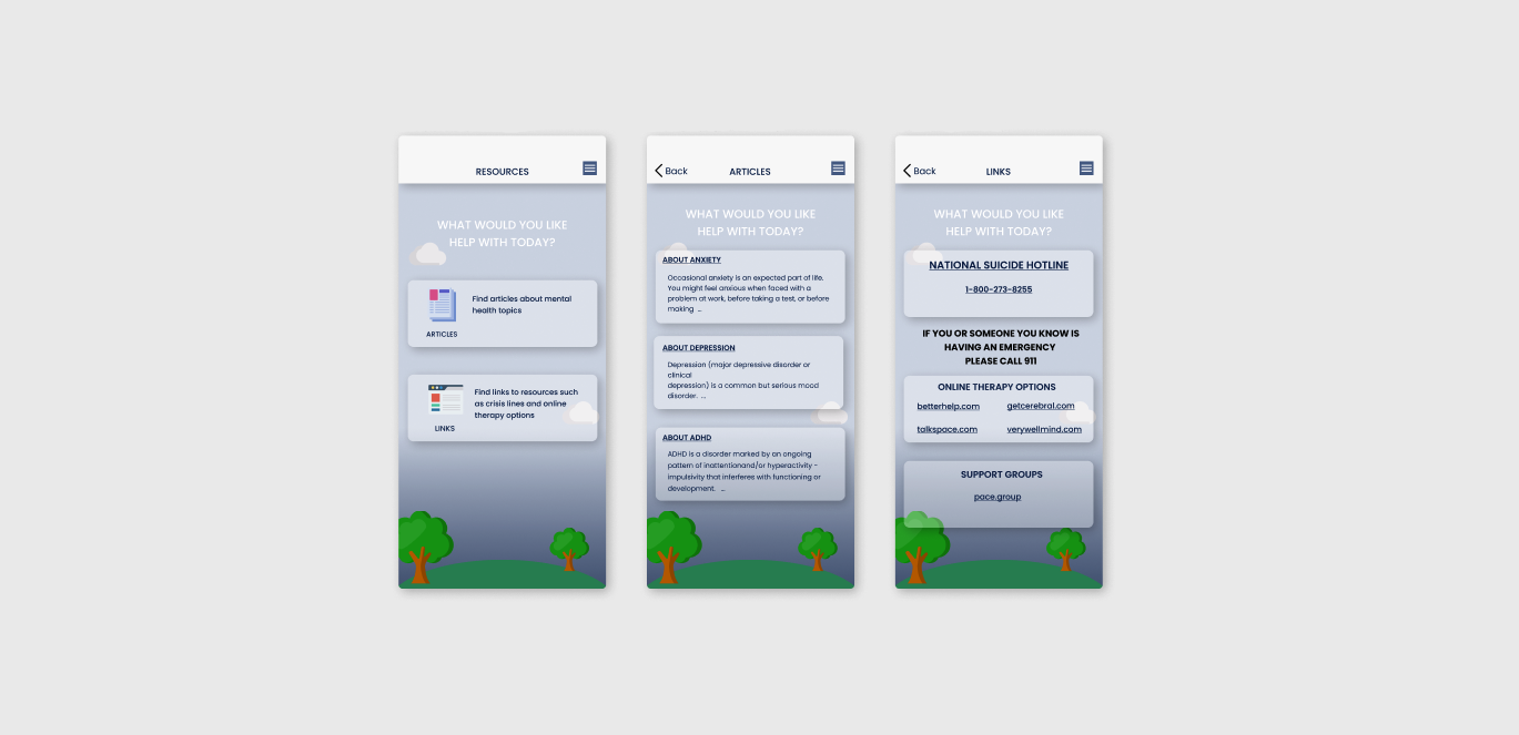
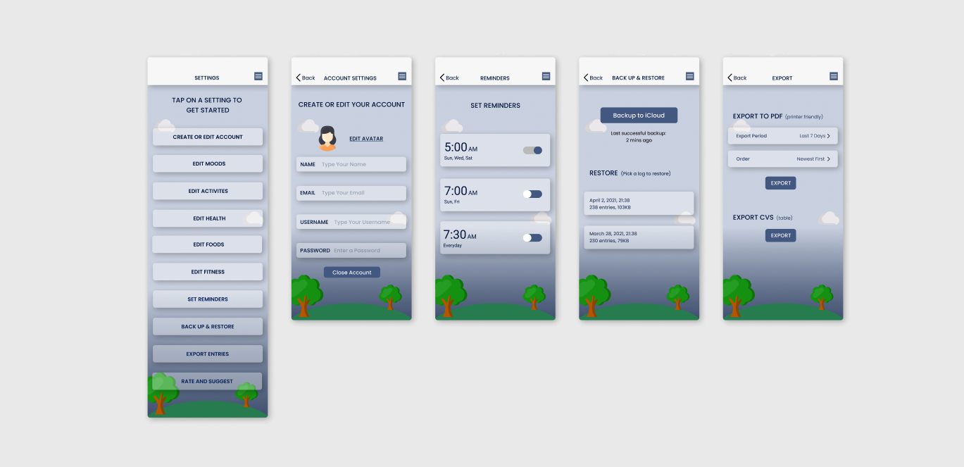
High Fidelity Prototype and Final Design
Here you can see the completed decisions. They address the user's needs for a simple yet engaging and uncluttered design that functions to meet the needs of the user to easily track their moods and find the mental health resources they may require. Users requested a change of the colors and button layout to make it easier to use and more aesthetically pleasing.
Conclusion
In the final design, I further addressed the users needs by created a more aesthetically pleasing
If you like what you see and want to work together, get in touch!
sarahavilene@gmail.com